In today's tutorial we will presenting how to create a better use of your pen tablet along with Photoshop's Brush Settings to achieve better results for an authentic watercolor style painting. We use some textures to your canvas and also make an appropriate brush for painting. So let's see.......
Step 1
To make it look like an authentic painting, I will first define a type of paper to my canvas to give it texture. Then I will make an appropriate brush to paint with. Finally, once the painting is complete, I will show you how to quickly add a convincing frame to it as well.
Photoshop already comes with various brushes, from which I will pick one and show you how to alter it and use it to paint better. So plug in your tablet, and lets do some painting!
SETTING UP YOUR DRAWING
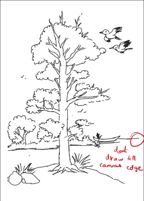
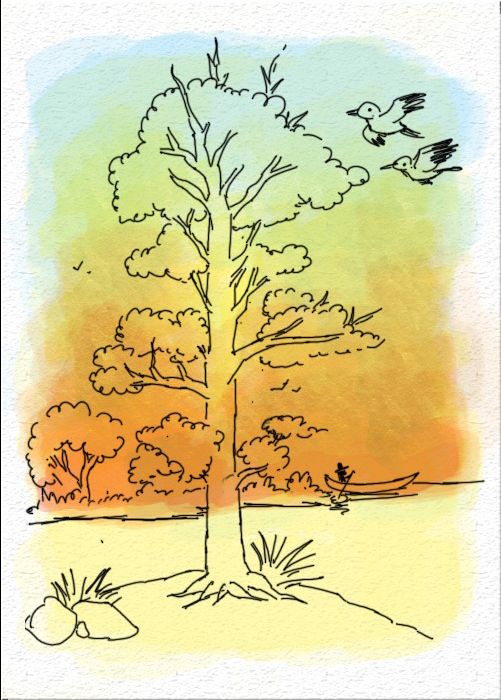
Okay, so the first thing to do is to make a sketch of the painting you wish to make. Here I have made a sketch of a landscape with its main focus on the huge tree in the center. Note that the lines that I have drawn don't go up to the canvas edges. You could either draw on the computer or scan in a drawing.
Name this layer of your drawing as Outline.
The drawing will be used just as a guide for our painting. But when you draw make sure your drawing doesn't go on to the end of the canvas. Also make sure you center it.
In the case of a scanned image, just set Layer Mode to Multiply
Once you have finalized the position, lock the layer.
Remember that the Outline Layer will always be on the top and all the color and background layers will come under it.
Step 2
CHOOSING YOUR CANVAS
In reality, we see that canvases have a texture and paint reacts with it. Why don't we create a texture for our canvas here as well?
To do that, Double-click the Background layer (which should be totally white) to make it Layer 0.
Still active on that layer, go to Layer> Layer Style> Bevel and Emboss...
Ignore the Bevel and Emboss options for now, click on the sub-option Texture .
Click on the Pattern button and load the Artists Surfaces . Here, feel free to choose any kind of texture you prefer for your paper (here I've chosen Washed Watercolor Paper).
Choose a preferable scale depending on your canvas size, but make sure the texture is neither too zoomed in or too minimized. Here I've chosen 100%.
Your texture is quite contrasted and dark. We must lighten it.
So now, come to the Bevel and Emboss Options. In Structure
settings, change the Style to Emboss and
decrease the Size to a sufficient quantity (here I have used 2px).
Now, rename this textured layer to Canvas and lock it.
Step 3
MAKING THE RIGHT KIND OF BRUSH
Now I will show you how to alter the brush settings in accordance to your canvas texture.
For this, got to Window> Brushes.
Now here there are many options to experiment with. But for this painting tutorial I'm going to have to restrict myself to a few options.Since I've chosen a watercolor style painting to do. The brushes I choose will be watercolor based as well.
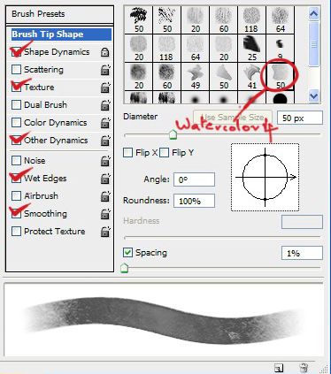
Go to Brush Presets and load Natural Brushes 2. Here you have different watercolor brushes. Pick any one you like. I chose the Watercolor 4 Brush.
Go to Brush Tip Shape and reduce Spacingto 1% .
Go to Shape Dynamics and make the Size Jitter is 0% and see that the Control is set on Pen Pressure , the Minimum Diameter should be 100%.
Go to Texture and load the very same texture which you chose for your canvas (Washed Watercolor in my case). Make sure that the Scale as well is the same as the one you used for the canvas. Set the Modeto Overlay.
Go to Other Dynamics, make sure the Opacity Jitter is on 0% and the Control set on Pen Pressure .Flow Jitter is up to you (I have used 31% here).
Also, tick the Wet Edges and Smoothing Options.
Step 4
PAINTING THE BACKGROUND
Now you have your brush made. Decrease the Brush Opacity to around 20-25% and set the brushMode to Multiply.
Create a new layer and name it as Background Color. This layer will be used for painting the background color alone.
Increase the brush size and start painting the background freely on your canvas with large brisk strokes. Notice that when you go over a previous color, the tone darkens. Use this to give darker tones or shadows. Also notice that the color fades with decreasing pen pressure, take advantage of this to blend two different tones.
Make sure that you paint the background light so that the other objects in your picture don't get darkly colored. So make sure the background is painted lightly.
Remember when you paint, make sure the color doesn't go over to the canvas edges. Make sure you centralize it so that the whole painting comes like an oval shape. It can be irregular that doesn't matter. It adds to the artistic effect.
Step 5
PAINTING INDIVIDUAL OBJECTS
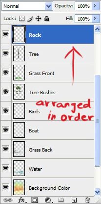
For every object you paint, create a new layer and name it after the object. When you paint, its important to make sure that you arrange the object layers in accordance to their distance.
That is, which object is in front and which is at the back. It is essential so that the object's individual colors stand out properly without overlapping. Like in my painting the Tree Layer comes on top of the Water Layer as the tree stand ahead compared to the water.
Now, since every object is painted on a new layer, if you go wrong in painting, You have to just delete that layer and redo instead of spoiling the whole painting. Since its in layers, there is no order to follow on what object to paint first and what not to.
Neatness in painting the objects needn't be give so much importance same such constraints will interrupt the free flow of strokes.
Step 6
OUTLINING YOUR PAINTING
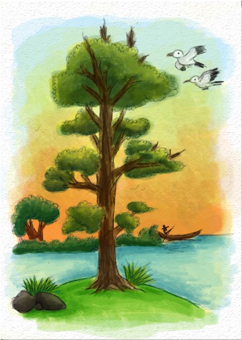
Now you would have finished your picture using your sketch as a guide.
Now such bold black outlines give it a more of a cartoon effect which is not desirable. We need more of an artistic watercolor painting.
So, the solution for this will be to unlock this Sketch Layer and reduce its Opacity to around 20%. To make it look just about visible.
Create a new layer underneath it and name it New Outline.
Before we start outlining, we will revert back some brush options so that we can outline better.For that open up the Brush Settings again. In the Shape Dynamics, reduce the Minimum Diameter to 0%.
Make the Opacity 100% and change back the Brush Mode to Normal. Choose the corresponding color of the object and outline.
Notice that the line is still light. Also note that going over it makes the stroke darker. Using this, outline the whole image with barely visible lines so that its neither too dark or there is nothing at all.
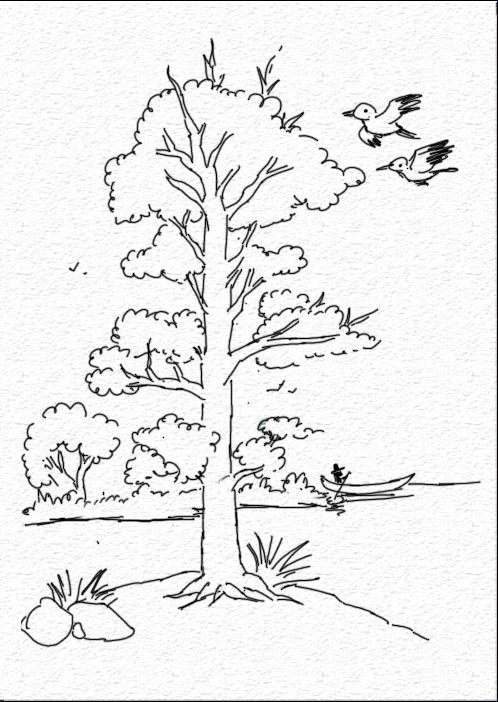
Once you outline it it will look as if the painting has been sketched lightly with color pencils.
Try not to make the lining too complex. Make it simple, just the exterior outlines are
needed.
Step 7
CREATING A SIMPLE FRAME
There! The painting is finally completed, but something is missing. The last thing to do now would be to add a frame to it. I'll make it quite simple here, needn't go too complex with the frame making. I'll have to save that for another tutorial. Create a New Layer and name it Applied Image. Go to Image> Apply Image and just hit the OK button.
Then, go to Edit> Stroke. I would like the frame to look more like it is made of wood. So I'll choose a nice brown color for it and set the Width to 15px. Set the Location to Inside. It can be a bit nice and wide since the painting is contained in an oval shape.
Once the border is put, we need to add relief to it. So, go to the Bevel and Emboss effects and make sure the Style is Inner Bevel and the Technique is Smooth. Also notice that in Shading I have changed the Gloss Contour.
Also tick the Contour settings and change the Contour there as well. The range can be altered to your liking.
Finally, go to Layer> Layer Style> Drop Shadow...In that, just increase the distance a little.
And just to show its your masterpiece, you could create a new layer and just put your signature at the bottom like the way i have done.
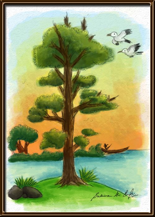
That is it! Your authentic type of painting is complete!
Thank you for reading my tutorial, I hope you liked it. Looking forward to post some more and better quality tutorials in the future!
Hope you can learn something new from this tutorial.
I feel really glad if you give me feedback through comment below. Soon i am going to show more interesting & innovative tutorials so please keep visit our blog. That’s for now.
Have fun!
Feel free to contact with Clipping Design for clipping path service, image editing service, image masking service or any kind of design support.
Thank you…
Credit: pxleyes.com
No comments:
Post a Comment