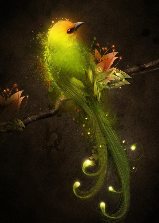
Today’s you will learn how to
make a beautiful night light Photoshop. Making this tutorial we use amazing
texture, brushes and Photoshop method. So let’s have a try…
Splatter brushes from deviantart:
http://snakstock.deviantart.com/art/Drip-Splatter-Run-and-Dribble-124603608http://osarionstudios.deviantart.com/art/Paint-Splatter-34435830
Texture from deviantart:
http://smoko-stock.deviantart.com/art/So-Long-What-Went-Wrong-129834123If you would like to create a similar image that is unique to you, you may find royalty-free stock resources on sites such as deviantart, sxc.hu, Wikimedia commons, and CGtextures. You will need basic knowledge of PhotoShop; how to use layers, masks, and the tools in the tool panel.
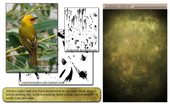
Create a new document, 8.5' x 13.5' at 300 dpi, RGB mode. Move your background texture from smoko-stock into the document. It will be too small, so stretch it until it fits. This will cause some loss in quality of course, but it is an acceptable loss and will not affect the image too much by the time it's done.
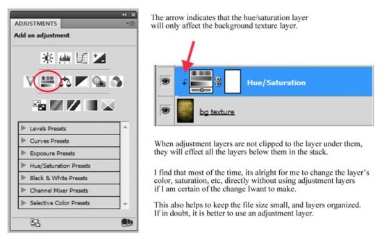
Hit Ctrl+U to bring up your Hue/Saturation options for the layer. Move the saturation slider all the way to the left, making the texture grayscale. Then darken it by moving the lightness slider to -70.
Alternately, you can use an adjustment layer to make these changes to the texture if you want to be able to go back and edit them later. To do this, open your adjustments panel and choose the hue/saturation icon. This will create an adjustment layer above the background texture which you may go back and edit at any time. To ensure that the adjustment layer only affects the layer directly under it, clip it to the background texture by moving your mouse between the layers in the stack. Hold down your Alt key, and the cursor should change from a hand into overlapping circles. Click to clip the layer on top to the layer beneath.
Tip: Even if you intend to use your image in printed materials, it will save memory if you create larger layer files in RBG and then later convert to CMYK once the image is complete.
Extract the bird from its background. The pen tool is usually the best option for doing this, because it is very precise. Then paste the bird into the document, and name the layer "bird." Make a selection of the bird, then go to Select > Modify > Feather and feather your selection by 2 px. Then go to Select > Inverse (or hit shift + ctrl + I) and hit delete. This will soften the edges of the bird, helping to reduce the "cut and pasted" look. Giving a 2px feather to each image you add to a photomanipulation is one small way to make the final image realistic and cohesive, rather than a collage of images obviously taken from somewhere else.
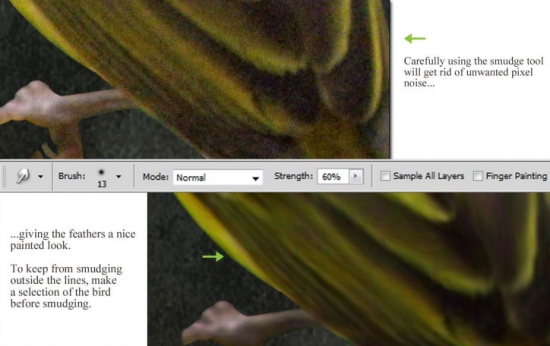
Grab your smudge tool, and smudge the bird all over to get rid of pixel noise and give the bird a more "painted" look. Make sure the smudge tool is set to a fuzzy round brush, in normal mode, with a strength of about 60%, and "sample all layers" unchecked.
Use short strokes, and follow the natural direction of the feathers. Smudge everywhere, being extra careful around the feet, eyes, and beak.
Now, we want to brighten up our bird and make him a little more colorful. Make a new layer above your bird, set the layer mode to overlay, and clip it to the bird layer. With a round, fuzzy brush at 25% opacity, paint with orange, green, and yellow to accentuate his colors. Take your time on this step. It may take more than one layer to achieve the colors the way you want them. Play with different hues, opacities, and blending modes until you are satisfied with the colors.
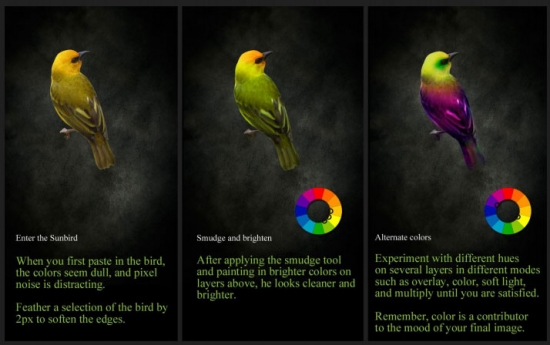
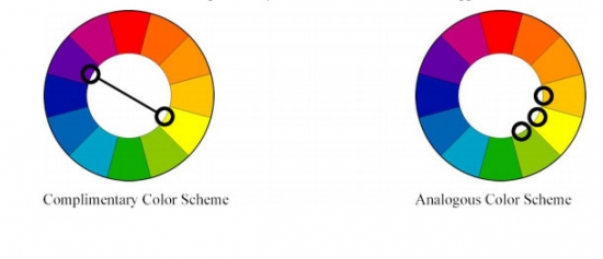
You can make your bird more interesting by changing colors just around his eyes, wings, or tail feathers. It can be helpful to choose your palette according to a color scheme. For myself, I prefer analogous color schemes (colors that are next to each other on the color wheel) and complementary color schemes (colors that are opposite each other on the color wheel).
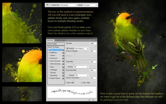
Now this part is fun... we will add some splatters to the bird to make it look as if he is made of paint. Load up your splatter brushes. Zoom in, and begin in whatever area suits you. Using the eyedropper tool, select some color at the very edge of the bird. Make sure you are on a new layer, and begin painting in some splatters around the edges.
You want your paint to overlap edges and feathers, like it has been carelessly splattered on from above. Use the eyedropper tool over and over again, and work your way around the edge of the bird, splattering as you go. You want about 50% of the defining edge to be covered. Switch up your brushes often to avoid obvious repetitious splatters. Vary the size, opacity, and orientation of the splatters as well as the color.
Make more layers for more splatters. Experiment with overlay and multiply mode. Erase any droplets you don't want. Add more paint on layers below the bird as well. In this image, I stuck mainly with different hues in green, yellow, and orange, but you don't have to stick purely to the bird's colors. Throw some pink, purple and blue in there to see what happens. That's what makes it fun... there is no wrong way to do it!
Now, take a close look at the bird's eye. There is some natural color and shine that needs to be accentuated. There are of course many ways you can use photoshop to perfect eyes, but here I will explain my method for this image:
1. Using a dark, saturated red color and a fuzzy round brush, paint directly over the entire eye on a new layer, and turn the layer's blending mode to multiply.
2. Make a layer above that, set to overlay mode. With a light red color, paint a slightly lighter area of the iris near the left edge.
3. Make a layer above that, in normal mode, and paint a slightly fuzzy black circle only over the pupil.
4. Make yet another new layer. Using the original image's natural eye highlight as a reference, draw in the shape of the reflected light with the pen tool. Fill the shape with white, and reduce the opacity slightly until you get the results you want. Here, I have turned the layer fill to 70% and added a slight inner white glow layer style. It may seem like splitting hairs for such a small area... but I maintain that tiny details are important! An alternative to using the pen tool to draw your own light is to use some sparkle or particle brushes.

When your eye is done, group all the layers used to modify it, and label the group "eye."
If you have used a different image for the tutorial, take a look at the other small, important areas of your subject. You may want to repeat these basic steps to sharpen and perfect certain areas. A human face would require similar adjustments to the eye area and lips. For birds, look at claws, eyes, and beaks. We will zero in on feathers next!
About midway through each project, I like to sit back and look at how it is working as a whole. Am I happy with the colors? The painting? The overall composition? Take some time to make any adjustments, or fix things that have been bothering you. Make sure all your layers are named and organized. And most importantly, remember to save your file!
Now we will add detail and definition to the feathers. This step can be quite time consuming, depending on how much you want to devote to it. Using the eyedropper tool once again, choose three colors from the bird's back feathers; a dark, a medium, and a light. Add these colors to your swatches, just so you have them around if you need them. We will be starting with the lightest color, so make sure it is the active foreground color.
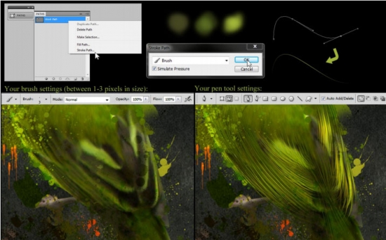
Make a new layer and select your brush tool. Select a tiny, 3 pixel brush with 100% opacity. Grab your pen tool, and draw in a single line at the edge of a feather where you want to give it more definition. Then, in the paths palette, right click on "work path," and select "stroke path." Choose brush from the dropdown menu, and check "simulate pressure." Then hit OK. When you deselect the path, you will see the result:
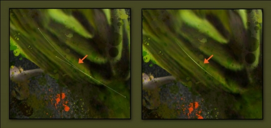
Repeat this action until you are satisfied with the area. Use the darker color on the bottom, and the lighter color on top. The darker 'feathers' underneath should be thicker. When you do the lighter feathers on top, use a brush that is only 1 pixel in size. It saves time and effort to duplicate the layers. When you do so, you can change the lightness/darkness and saturation of the feathers (ctrl+U), rotate them, or size them to get them to look as you want them to.

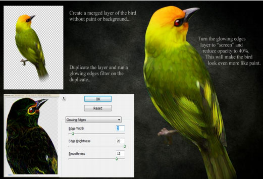
Next we will add some glowing edges to the bird. Turn off the visibility of the background and paint layers, so that the only things you can see are the bird and feather detail. Hit ctrl+A to select everything you see, and go to Edit > Copy Merged, and paste as a new layer on top of everything you have done so far. Duplicate the merged layer - don't forget this step! Then go to Filter > Stylize > Glowing Edges. Set edge width to 2, brightness to 20, and smoothness to 13, and hit ok. Set the glowing edges layer mode to screen, and reduce the opacity to 40%.
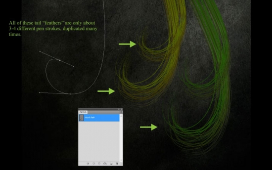
To create the long, flowing tail feathers, simply use the brush to stroke your pen path technique. Duplicate your layers often. Vary your colors and brush sizes between 1-3 pixels. Keep variation in your colors. If you have a pressure tablet, you will not need to spend so much time drawing with the pen tool... but this is a good option if you are operating without one. Once the tail feathers are complete, breathe a sigh of relief! You are almost done!
Now, we want our bird to have a gentle, warm glow. To warm up the overall feel of the composition, go to Layer > New Adjustment Layer > Gradient Map. (Or, simply click the gradient icon in the adjustments panel.) Do not check "use previous layer to create mask" because we want the adjustment to affect everything we have done so far. (Choose a color if you like, it only affects how the layer appears in the layer stack.) For mode, choose color and leave opacity at 100% for now. Then hit ok.
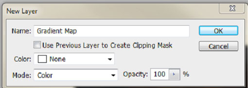
A new adjustment layer will appear using whichever gradient you had active - which will probably be black to white, as that is the default gradient. In your adjustments panel, double click the gradient to choose your own colors. Make a new gradient using orange, brown, and gold tones. Once you have your gradient, hit ok. Then, play with the opacity level of the layer until you find an effect which pleases you. I have left my gradient map at 30% for this image.
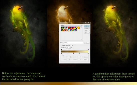
A quicker, lazier way of achieving a similar effect is to simply create a new layer, fill it with solid brown (or green, or blue, or whichever color will help you achieve the mood you are after) turning the layer mode to color, and reducing the opacity.
This final image actually uses several such layers, varying from light brown to dark red, interspersed throughout the layer stack. Adding these adjustments as you go helps to tie together your image, brushes, and other elements, making your image more cohesive as a whole.
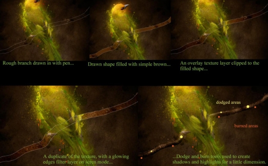
Now we want something for our bird to be holding on to, so he doesn't look so lost sitting in space. Draw out a rough shape with the pen tool resembling a branch, and fill it with a medium brown color (be sure to fill your path with brown on a layer sitting under the bird and paint splatter layers, but on top of the background layer).
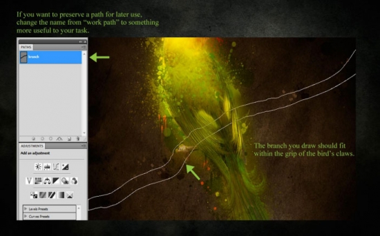
To give your branch some texture, copy the background texture layer and clip it to the branch shape layer, then turn the texture to overlay. To get it to match the composition, repeat the glowing edges trick. With the burn and dodge tools, burn the edges of the branch and lighten the center to give it dimension.
To create the glowing tail feathers, draw a several spiraling shapes. On a new layer, fill with a green matching the hues in your tail. Then reduce the opacity, and give the layer style a slight, bright green inner glow. To create glowing spots, use a fuzzy white brush. On a new layer, click over the tip of the feather and experiment with color dodge and overlay modes.
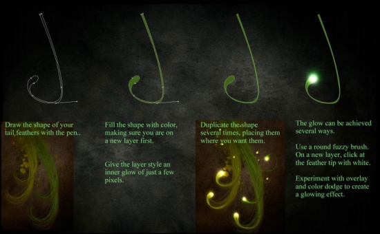
Repeat this same process of drawing basic shapes, filling them with color, and giving them glow to create the flowers. It might be fun to try some hanging bell flowers or fern leaves! If you aren't comfortable using the pen tool to draw your own elements, try using some custom foliage shapes, vectors, or brushes from Deviantart instead.
Since we want to give the impression that the bird itself is the light source, make appropriate highlights and shadows on each element you add to the manipulation.
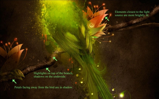
All that is left now is to make some last adjustments to the final image. If you like saving your layer files, save a copy first. Then go to Layer > Flatten Image. There are several improvements we can make to the final image once the composition is complete.
First, duplicate the background layer twice (Ctrl + J). Then go to Filter > Blur > Gaussian Blur, and blur the top layer by 35 pixels. Then turn the layer mode to soft light and lower the opacity to about 20%. This will give the entire image a soft, fantasy-ish glow. Finally, go to Image > Adjustments > Photo Filter. Choose a warming filter or an orange color, and set the density to about 30-40%. Check the preview box so you can see the difference the filter will make. Hit OK. And you're done!
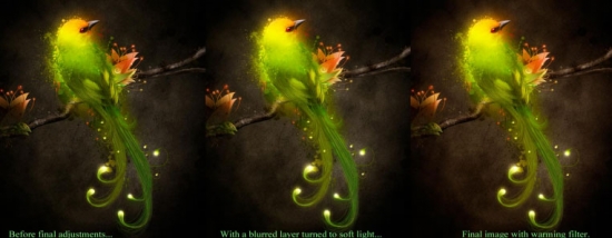
Hope you can learn something new from this tutorial.
I feel really glad if you give me feedback through comment below. Soon i am going to show more interesting & innovative tutorials so please keep visit our blog. That’s for now.
Have fun!
Feel free to contact with Clipping Design for clipping path service, image editing service, image masking service or any kind of design support.
Thank you… 
Credit. webdesign.org
No comments:
Post a Comment