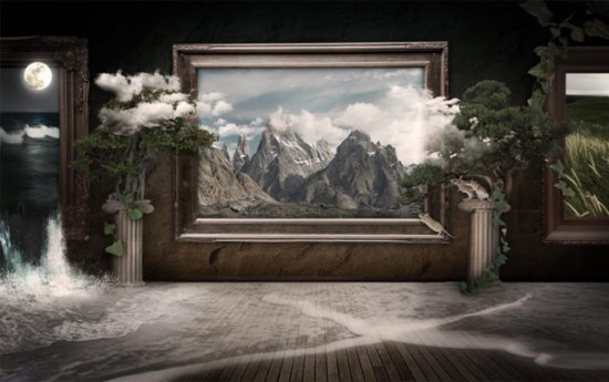
In this tutorial, i want to show that how to make a awesome living museum in Photoshop It's very simple tutorial. we use brushes, effects to make it. so let's have a look...
Step 1
Assemble your stock images and brushes. All resources used in this image are from deviantart. Some are available exclusively to deviantart members. Always make sure you have license to use your chosen stock and be sure to give proper credit to the provider. If you choose to post the image resulting from this tutorial anywhere online, you must credit the stock provider by linking back to their deviantart account.
You don't have to use the exact textures and images I used. You can achieve a similar effect that is unique to you by finding your own stock images on sites such as deviantart, sxc.hu, CG textures, and Wikimedia commons.
This won't be so much of an exact and precise, step-by-step tutorial. Rather, I will explain the basic steps and techniques I used... but I will be specific in some areas. This tutorial assumes you have basic knowledge of photoshop - how to use layers, layer masks, filters, and the tools in the tool panel.
water on floor: http://morbystock.deviantart.com/art/beach-stock-13-75990604
wall texture, plants, other mice:sxc http://www.sxc.hu/
Step 2
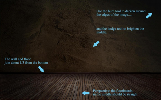
Begin with the floor and wall. Open up the images you will be using and move them into a new document. (I used 9'x5.5' at 300 dpi). For aesthetic purposes, it works well to join the floor and wall about a third up from the bottom.
Step 3
Use Edit > Transform > Perspective to adjust the floor. Depending on the floor you choose, it can be difficult to get the perspective right. Make sure that the planks in the middle look like they are coming straight down toward you.
Step 4
The two images have likely come from totally different sources, so at first they will not look like they belong together. But we need this to look like a cohesive, realistic image. As you add more images to the file, a good way to get the images to look as if they belong together is to adjust hue, saturation, and levels. Do this now with the floor and wall until their colors and sharpness match. Use the dodge and burn tools to darken the edges and brighten the middle. This, combined with the perspective of the floor, will help to draw in the viewer's eye.
Step 5
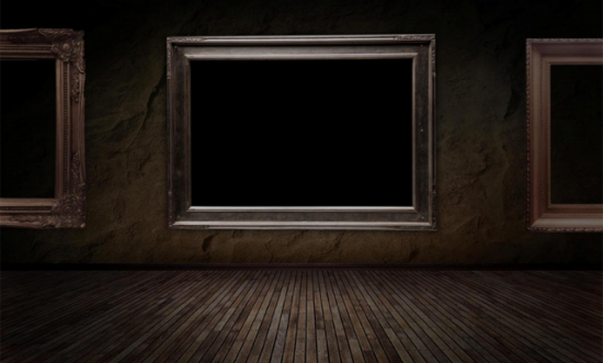
Next, extract your frames. Take some time to make a clean extraction for each new image you add to avoid unwanted pixels around the edges. The pen tool works best for me to do this because it is very precise. The frames are easy... but images like plants and animals can be very time consuming. Size the frames and place them where you want them. Be sure that you are naming each new layer as you add it, and save often.
Step 6
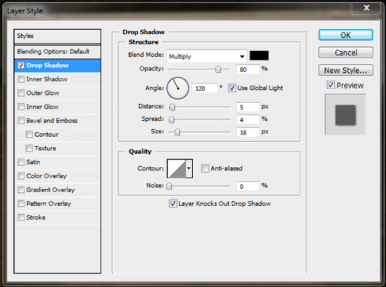
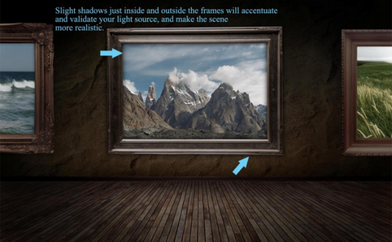
Always keep an eye on the lighting of each new image you add. If your frames seem to bright or too dark, use curves, hue/saturation, or the dodge and burn tools to fix it. Remember that for the purpose of this image, we want the center to be brightest, and the edges to be in shadow. Imagine that the light source is coming from just above your view, and just behind you. For a touch of realism, give the frames a slight shadow inside and outside at the edges. You can do this by adding a drop shadow layer style to the frames:
Step 7
Time to fill the frames with scenery. I chose one field scene, one ocean scene, and one mountainous scene for some variety. Paste your scenery into the file on layers under the frames, and size and move them into place. Make sure to name the layers and save your file.
Step 8
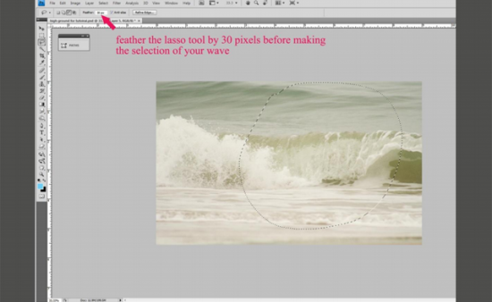
Its starting to look like an art museum! To begin bringing it to life, we want the ocean to spill out of the left frame. Open up your wave image. Select your lasso tool, and in the tool's settings, give it a feather of about 30 pixels. Draw a rough circle around the area you want to be "splashing out" of the ocean frame.
Step 9
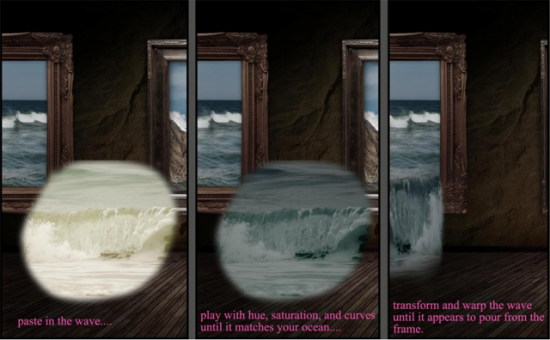
Paste the feathered selection of wave into your file. Adjust the color and sharpness of the water until it matches the water in the ocean frame a bit better. Resize, warp, and stretch the wave until the top seems to be leaving the frame, and the bottom falls onto the floor. Give the wave layer a mask. With a large fuzzy brush at 50% opacity, blend the wave into the ocean. It can be difficult to get this part right... water can be tricky. Don't worry about the edges of the wave just yet.
Step 10
Now we need to make the wave look like it is pooling on the floor. By searching stock image sites for "beach" and "wave" you will easily find an image that fits the angle we need. Look for a beach wave that is travelling toward you to the right. Paste it into the file, and use a layer mask to blend the edges.
Step 11
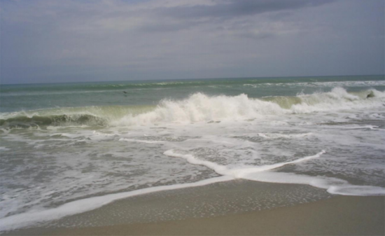
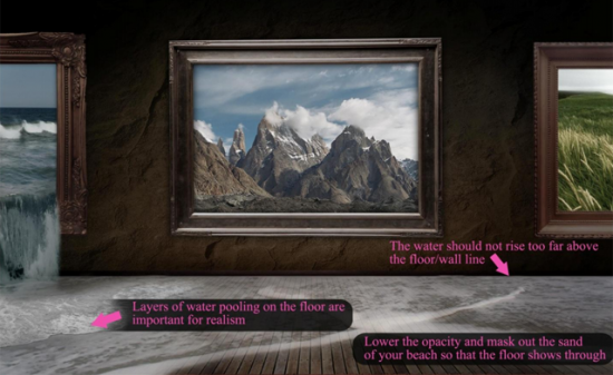
Open up beach stock 13 by MorbyStock from deviantart. Copy and paste the waves into the file, placing the waves over the floor. Lower the opacity and mask out the sandy areas so that the floorboards show through. Opacity masks are your best friend when it comes to blending images together. It is good practice to use a layer mask rather than erasing part of your image, as masks are fully editable.
Step 12
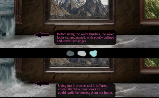
Use the splash water brushes to make the edge of the wave more realistic. Use the eyedropper tool to select the color of the water at the very edge of the wave. Then add some lighter droplets with light grey or light blue above the darker colors. Zoom into this area to make sure that your details are working together. Also, make sure that you are painting the water additions on a new layer.
Step 13
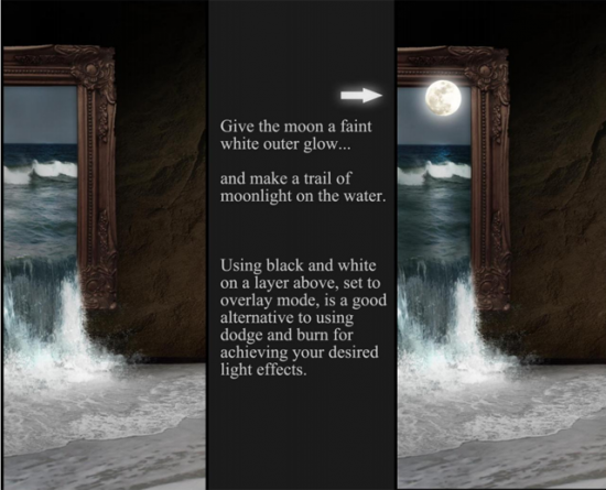
As you go, you may find it helps to keep your file organized and manageable to merge layers when you are happy with them. When you are happy with the left frame and its escaping wave, merge the layers together. This will also keep your file size small and photoshop running quickly. Now, we want it to be night time on the ocean. Use the burn tool to darken the water and sky, and paste in the moon. Give the moon a subtle outer glow, and move the outer edge above the lip of the frame so that appears to be rising out of the picture. With the dodge tool, add a moonlight trail on the ocean water.
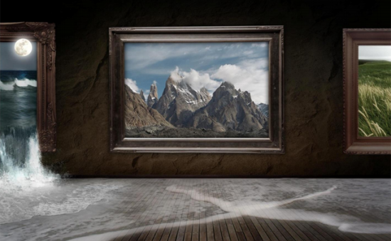
So now here is our image, starting to come to life!
Step 14
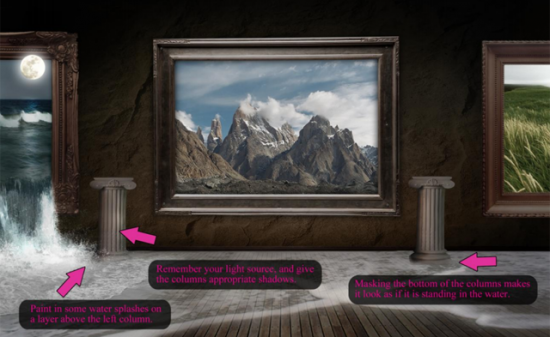
We will now add the imagery to the room, "outside" the frames. Extract the Roman column and paste it in to the file on a new layer. Again, play with your hue, saturation, and curves until the column seems to match its environment. Give it highlights and shadows with dodge/burn. Mask out the very bottom of the column so that it appears to be standing in the water on the floor. Then copy the layer, and place one on each side of the middle frame.
Step 15
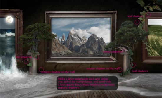
Repeat these basic steps for every new element that you add to your image. Always give everything its own new layer, naming them as you go. Use layer masks to soften any edges that seem too striking. Use hue, saturation, and curves to make the objects look as if they belong in this environment... not just pasted from somewhere else. Use dodge and burn to give each object highlights and shadows. Remember that some objects will need to cast more obvious shadows than others.
I almost never use drop shadow layer styles to create object shadows, because it can make the object look too flat. Drop shadows are alright for flatter objects, such as the frames. But when creating shadows for bulky or organic things, this will look false. Instead, paint black with a fuzzy round brush at a low opacity on a layer under the object you want to give a shadow to. Try to visualize what shapes the shadows would make if your light source were real. It helps that this manipulation is kind of shadowy and dark in nature... so it is good practice and will look good even if you don't get it quite right.
Step 16
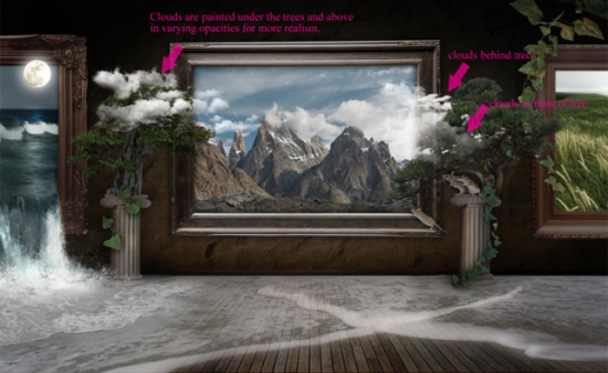
We are almost done! Now we need to bring to life our field and mountains. Load up your cloud brushes. On a new layer, paint in some white clouds so that it looks like they are emerging from the middle frame. It will look more natural if you use varying opacities for the clouds. Add more clouds on a layer under your trees, so it looks as if they are flowing out of the frame into the trees in the room.
Step 17
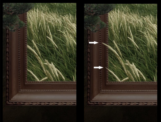
We have given a magical life to the sea and mountains, now we just want the field to escape a little. Zoom in so you can see the details of the grasses. Make a selection of some of the wheat tips, copy, then paste on a layer above the frame which encloses them:
Step 18
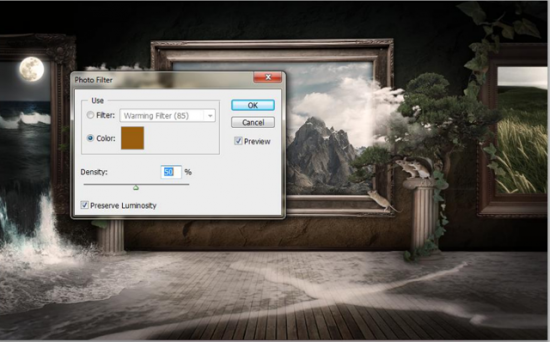
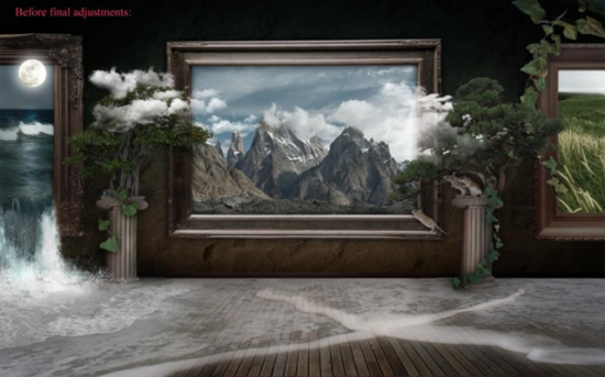
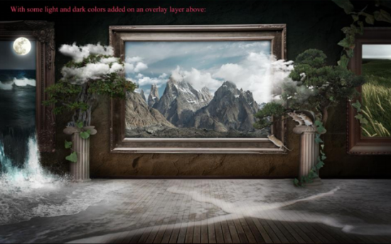
Once you have added all the details you like, there are just a few finishing touches. On a new layer set to overlay mode, darken the edges of your image with a black, large fuzzy brush, and brighten the middle with white. This will make the image seem more dynamic and bring the focus to the center even more. Then, only once you are fully satisfied with the image, go to layer > flatten image. (If you like keeping you layer files like I do, save a copy before you do this). Then go to filter > sharpen > sharpen, to make the details a little crisper. Finally, go to image > adjustments > photo filter. Choose a warming filter or color to tint your final image, with density at 50%. Keep the preview box checked so you can see the difference your filter will make on the image. This gives the museum a gentle, old fashioned feel by adding a touch of sepia.
You're done!
Hope you can learn something new from this tutorial.
I feel really glad if you give me feedback through comment below. Soon i am going to show more interesting & innovative tutorials so please keep visit our blog. That’s for now.
Have fun!
For clipping path service, image masking service or design support please contact ClippingDesign.com.
Thank you… 
Credit:webdesign
No comments:
Post a Comment