Step 1: Create a new Photoshop document
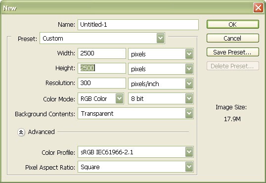
Create a new file with a width of 2500px and a height of 2500px at 300 dpi (Dots per Inch). The Background Contents setting should be set to Transparent.
Step 2: Prepare the Antelope Island stock photo
Let’s start with the Antelope Island photo. First, download the antelope island 35 image listed in the Resources section at the top. Save that image to your computer. Go to File > Open and find your downloaded images.
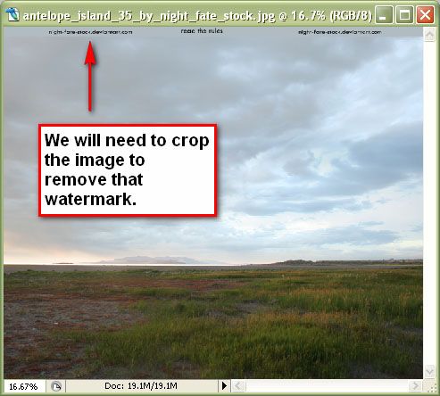
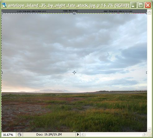
Notice that the image that we have opened has a watermark on the upper part. We’ll need to remove that. Hit C to activate the Crop Tool (C). Drag a selection to the edge of the photo, leaving out the watermark, and then press Enter to crop the image.
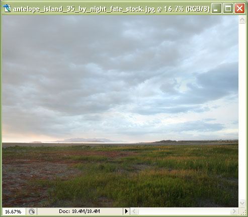
It’s time we put our cropped image on our main canvas. Click the cropped "Antelope Island" image, press V to activate the Move Tool (V) and then drag the image to the main blank canvas.
Once you’ve moved it, activate Free Transform (Ctrl/Cmd + T) to transform the image so it’s the same size as our canvas. Hit Enter to accept the transformed state.
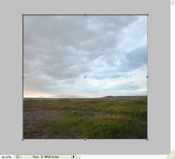
Step 3: Creating a long exposure effect
In this step, we will try to mimic the effect of a long exposure photo. We’ll make the clouds appear as if they’re moving.
We’ll have to separate the sky from the land first; to do that, we’ll use the Polygonal Lasso Tool (L). The Polygonal Lasso Tool is almost like the Crop Tool but you have better control over it.
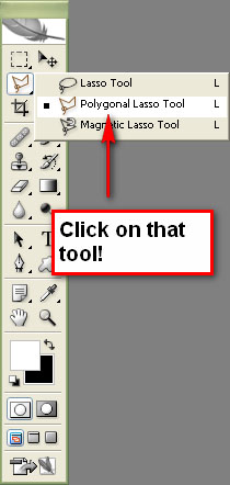
Press F to change the view to Full Screen Mode With Menu Bar (or go to View > Screen Mode > Full Screen Mode With Menu Bar). This will give us a more room to work with.
Start creating a selection with the Polygonal Lasso Tool, starting anywhere outside the canvas, and then capture the sky.
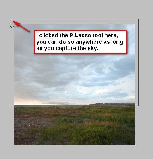
The selection should look like this when it’s done:
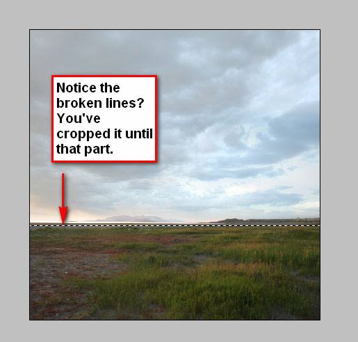
Now that we have what we need selected, press Ctrl/Cmd + J to duplicate the selection on another layer above it. We’re separating it from the original image because we are going to give it a touch of motion blur.
Go to Filter > Blur > Motion Blur, using these settings:
Angle: 0
Distance: 200

With the Motion Blur Filter applied, it will look like this:

Go back to Standard Screen Mode view by pressing F twice (or go to View > Screen Mode > Standard Screen Mode).
Step 4: Incorporate the Winter beach stock photo
Now let’s open the other image we need for the scene, the Winter beach photo. Download it and open it in Photoshop. Move it to our canvas using the Move Tool (V) like we did with the Antelope Island photo.
Position the image in the canvas like so:
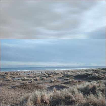
Step 5: Remove the sky from the Winter beach stock photo
Let’s remove the sky in Winter beach photo. To do that, we’ll use the Polygonal Lasso Tool (L) again. Press L to activate the Polygonal Lasso Tool, and then press F to toggle the screen mode to Full Screen Mode With Menu Baragain. It is much easier to use the Polygonal Lasso Tool while we’re in Full Screen Mode.
Create a lasso selection like below.

Hit Delete to take that sky away.
Then press Ctrl/Cmd + D to deselect your selection.
Step 6: Fix the angle of the beach stock photo
The photo seems a little bit crooked. Let’s make it straight. Click on its layer in the Layers Panel and then press Ctrl/Cmd + T to go into Free Transform mode.
Right-click anywhere within the selected part and choose Warp in the contextual menu that pops out.
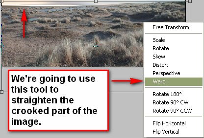
When using the Warp Tool, a box that has nine squares will appear, these are your transform controls. To adjust the image, you just have to pull the respective transform control to the position that you desire. In this image’s case, we would need to pull the transform control in the upper left corner and the two circles to its right.
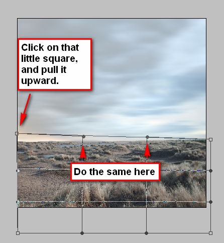
Adjust the image using the Warp Tool until you’re satisfied with its look. If you’re not satisfied, you can always undo your transformation and enter the Warp transform mode again.
Step 7: Remove the waves/sky from the original image
If you take a closer look at the edges of Winter beach, you’d see that there are some bits of blue (from the waves or the sky of its original image). We must remove those because it is quite distracting and ruins the scene we’re trying to make.
Let’s use the Polygonal Lasso Tool again. Press L and then select the part of the image that we need to remove. Press Delete to remove the selected area.
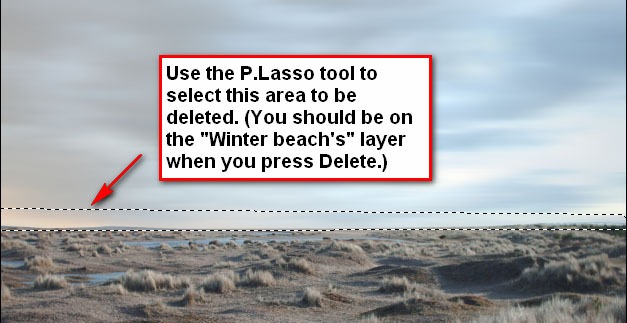
Hit Ctrl/Cmd + D to deselect your selection.
Step 8: Resize the sky
Now let’s blend Winter beach with the sky of Antelope Island. To do that, we will erase the ground at the horizon to make it seem like it is one with Antelope Island. Before we do that, we’ll need to increase the length of the sky so when we erase Winter beach, it will produce a minimalistic and foggy horizon. So use the Free Transform Tool with the sky layer selected, and drag it down to increase the length.
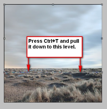
When you’ve done that, hit Enter to apply the transform.
Step 9: Create a foggy horizon
After you’ve resized the sky, let’s move on to creating the foggy horizon. Hit E to activate the Eraser Tool (E). Then use these option settings for the Eraser Tool:
Brush size: 175
Opacity: 100%
Flow: 100%
Then position the Eraser to a level near the field and drag it to the edge. You’ll notice that it will create something that is similar to a foggy horizon.
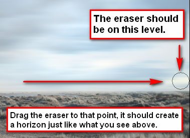
Step 10: Apply a Graduated Neutral Density Filter effect
If you’re into photography, you’re probably familiar with the Graduated Neutral Density (GND) Filter; it darkens the sky and leaves the ground unchanged. We will reproduce that effect here. Notice that the sky is too bright? We’re going to reduce that.
First, create a new layer (Ctrl/Cmd + Shift + N). Name the layer something intuitive like "Dark sky". Leave the other boxes in its default state. You can also click on the Create a new layer icon at the bottom of the Layers Panel.
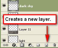
Now we’re going to mimic the effect of a GND Filter. We’re going to paint the sky with black. Hit B to activate the Brush Tool (B), and then set its Master Diameter ("brush size") to 1500 and Opacity to 35% in the Options bar. Now let’s use the brush on the dark sky layer. Paint the sky with black.

If it looks unnaturally dark, you can turn the layer’s opacity down, but try to keep it at 100% opacity if you can.
Step 11: Place and process the umbrella into our scene
It’s time we put our scene’s subject onto our canvas: the umbrella. Download the umbrella from sxc.hu and open it in Photoshop.
Then use the Polygonal Lasso Tool (L) to remove the umbrella from its background by tracing on the edges of the umbrella. Use the Zoom Tool (Z) to zoom into the image if you have to to make this process easier. Once you’ve made your lasso selection around the umbrella, press V to activate the Move Tool (V) and drag it to our existing layer.

You’ll notice that its color is quite saturated, so let’s tone it down. While on the umbrella layer, Press Ctrl/Cmd + U to open the Hue/Saturation dialog box. To get the right effect, uses these settings:
Hue: 0
Saturation: -70
Lightness: 0
This will give you a light pink umbrella.
Now let’s transform it (Ctrl/Cmd + T) to rotate it upside down and change its position according to our original composition using the Move Tool (V).
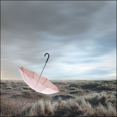
Step 12: Adjust the umbrella’s brightness
If you’d notice, the umbrella looks too bright. Note that even if you use the Burn Tool or manually paint black on it, it would look unnatural. So let us decrease its overall lightness. Press Ctrl/Cmd + U again to open the Hue/Saturation dialog box. Be sure you are on the umbrella’s layer in the Layers Panel when you adjust the Hue/Saturation. Set the Lightness value to -10.

Step 13: Apply shadows to the umbrella
Now let’s apply shadows to the umbrella to make the lighting natural. Press O to activate the Burn Tool (O).

Use these settings:
Brush size: 200
Range: Midtones
Opacity: 25%
Use the Burn Tool on the part where the light naturally wouldn’t shine on the umbrella. Try to balance things out; don’t over darken it while leaving the other parts of the umbrella (where the light shines) too brightly.
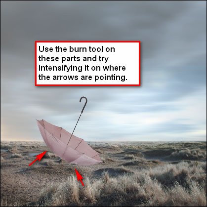
Step 14: Intensify the shadows
I don’t recommend using the Burn Tool to intensify the shadow. Instead, let’s intensify the shadow using the Brush Tool (B). However, I don’t want to hold you back – if you can do this using the Burn Tool then that’s alright too!
Press B to activate the Brush Tool (B). Set the Opacity to 5%. I’m going to leave the brush size/master diameter up to you (some like it big, some small).
Paint on the parts of the umbrella where you want the shadow to be more intense.
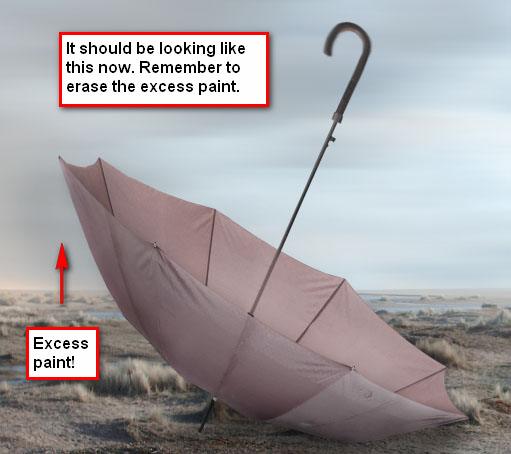
After you intensify the shadows, remember to erase any paint that has been rendered outside of the umbrella. You can accurately erase those using the Polygonal Lasso Tool.
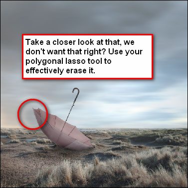
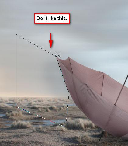
Step 15: Paint shadows on the ground
Let’s paint shadows on the ground. Brush the ground where the umbrella blocks the light. See the image below as a reference.
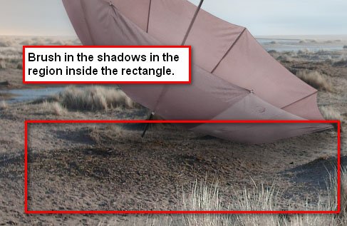
Step 16: Fix the perspective of the umbrella
Now let’s try to fix the viewer’s focus on the umbrella to make the scene realistic.
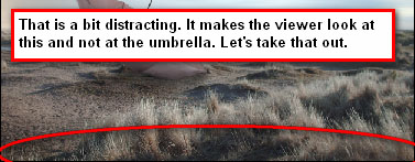
Use the Brush Tool (B) and let’s paint black over that region.
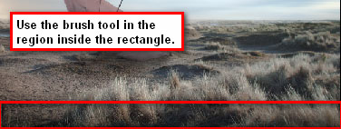
Step 17: Create a vignette
Let’s create a vignette to increase the focus on the umbrella. To do that, we need to create a new image. Go to File > New or press Ctrl/Cmd +N. Use almost the same settings as the current canvas: Width of 2500px, Height of 2500px, and set Resolution at 300 dpi. But take note, the Background Contents should be set to White this time.
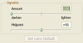
Once the new canvas has been created, go to Filter > Distort > Lens Correction. Under Vignette, use these settings:
Amount: -100
Midpoint: +50
Drag that vignette layer to our main canvas using the Move Tool (V) and put it on top of all the layers that we’ve created thus far.
Then set its layer’s Blending Mode to Multiply and its Opacity to 15%.

You can adjust the opacity as per your wish but I would strongly recommend 15%.
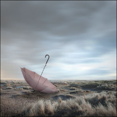
Step 18: Photo retouching with Fill layers
It’s time to retouch our photo. We’re going to have to use multiple fill layers for this.
Click on Layer > New Fill Layer > Solid Color.
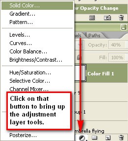
In the Pick a solid color dialog box, use a dark blue (almost black) color (#03011d).
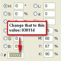
The fill layer will appear on our Layers Panel and it will show the color of the fill layer that we’ve chosen. Notice that our image is now slightly yellow. We don’t want it that way, so let’s decrease its Opacity to 40% and set its Blending Mode to Exclusion.
Create a new solid color fill layer again, but now use a dark brown color (#3f3127) and set its Blending Mode to Soft Light and Opacity to 40%.
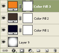
Create yet another solid color fill layer. This time use an orange solid color fill (#f2801c). Set the Blending Mode toSoft Light and set its Opacity to 5%.
Here’s what we’ll end up with after all of those adjustment layers:
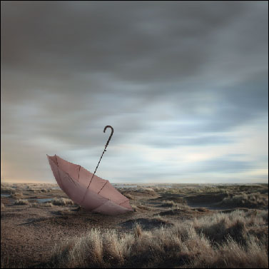
Be sure that the layers are in this order:
Step 19: Use a Gradient Map adjustment layer
Now we’ll use a Gradient Map adjustment layer. We’re going to use this to desaturate the image. You can use the Hue/Saturation adjustment layer, but I would recommend the Gradient Map in this situation. Go to Layer > New Adjustment Layer > Gradient Map.
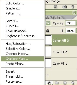
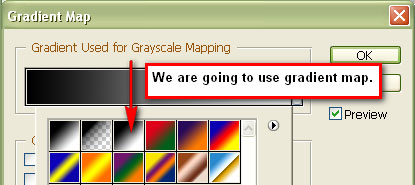
Then choose this gradient map and set its Opacity to 45%.
Step 20: Adjusting the scene’s colors with Curves
We’re going to tinker with our piece’s color now. We’re going to use the Curves image adjustment to do this.
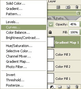
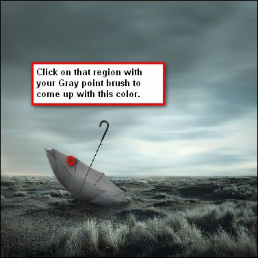
Go to Image > Adjustments > Curves to open the Curves dialog box. You’ll see three eyedroppers, each with a specific color on the bottom right side of the box. These eyedroppers are black, gray and white. Click on the Gray eyedropper (it’s for sampling the gray point in the image). When you click on a specific part of the image, the image’s white balance will change. Click on the area as shown in the following image.
Step 21: Apply a Photo Filter adjustment layer
Create a new Photo Filter adjustment layer to round out our scene.
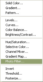
For the Filter setting, use Sepia and for the Density setting, it should be 25%. Also, check the Preserve Luminosity box. Hit Enter after changing the settings to apply the adjustment layer.
Step 22: Adjust the contrast
It’s time to increase the impact of our scene. We will be adjusting the contrast. Click on the Create new fill or adjustment layer button at the bottom of the Layers Panel and find Brightness/Contrast. Set the Contrast value to +10.
Step 23: Adjust again with Curves and Color Balance
Create another Curves adjustment layer like we did in Step 20. Use the Gray point eyedropper and once again click on the same location.

Your scene should be looking more frigid now.
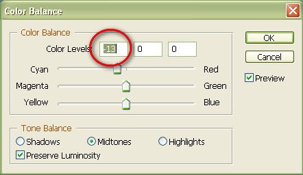
To increase its coolness, you can add a Color Balance adjustment layer.
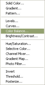
Set the values as shown in the following image.
Step 24: Finishing up our scene
Before proceeding, you may want to save your work as a layered PSD or TIFF before you continue because we’re going to flatten the image.
Right-click on your color balance adjustment layer (or on any layer) and choose Flatten Image.
You can sharpen and bring out more details of your image by going to Filter > Sharpen > Smart Sharpen. Set the values to Amount: 125% and Radius: 1.0. Under the Remove setting, choose Gaussian Blur and click on the More Accurate tick box. Press Enter to apply the Smart Sharpen filter.
You may want to save the finished file in the TIFF format for you to be able to edit it in the
future without destroying the image. If you saved it as a JPG file, you must not do any retouches to it or the image quality will be degraded.
Conclusion
We did a lot in this tutorial! In summary, I showed you a process for bringing together several photos and making it into one dark and melancholic scene. If my tutorial has inspired you in any way, please post it on the Flickr group poolor share a link with us in the comments. I’d like to hear your thoughts and questions in the comments below!
Hope you can learn something new from this tutorial.
I feel really glad if you give me feedback through comment below. Soon i am going to show more interesting & innovative tutorials so please keep visit our blog. That’s for now.
Have fun!
Feel free to contact with Clipping Design for clipping path service, image editing service, image masking service or any kind of design support.
Thank you…
Credit: http://designinstruct.com

No comments:
Post a Comment