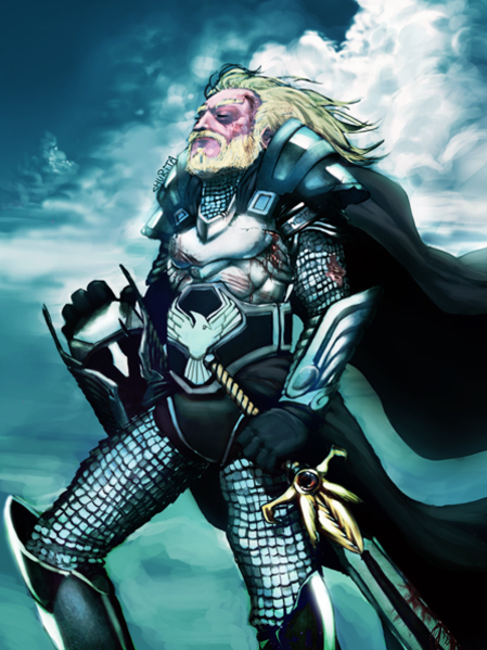
Today's we presenting how to illustrate a victorious warrior knight who is happy and relived that the battle is over. This tutorial will require the use of a tablet and will make extensive use of digital painting techniques. So let's have a look....
Step 1
Create a new document 1125 x 1500px at 250dpi.

Step 2
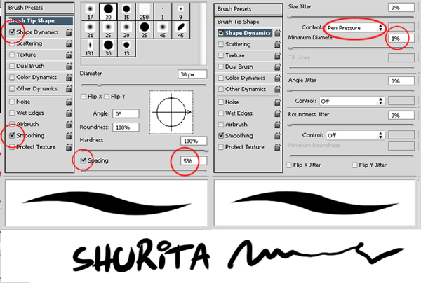
I will be using three main brushes throughout the illustration. I recommend that you build your own set of brushes and stick to three or four. Just to keep the simplicity at maximum. This is my main brush. I love it. It gives a rough feel and you can add as many details as you like.
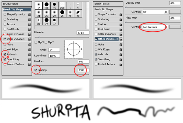
Mainly used for hair and fine details.
Glows! Metal, gold, chromed materials, you name it. Used a lot in background (clouds specially).
Step 3
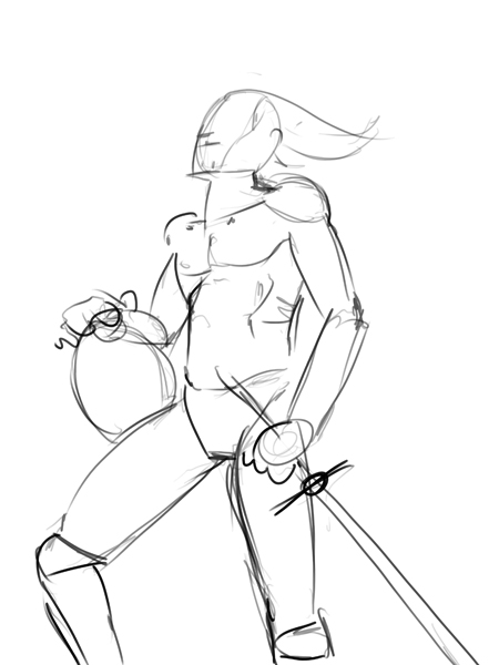
Start drawing. If you have a specific image in your head, go for it. Mine will be a knight standing comfortably under a nice cloudy morning sky. It is important to first draw your character without clothes. This will give it a strong and realistic look.
Step 4
Suit on. I like to keep things simple: Few layers, one if possible. Just use white to erase. It is important to bear in mind that in every single step details will be added.
Step 5
Just keep drawing. You will eventually come up with something useful and fun. It is up to you how much you decide to enhance your image.
Step 6
Shadow and tone rendering. Take into account the element you are illustrating. Skin has different texture than chain mail, leather, gold or hair. Each item reacts differently to light. It is crucial you are aware of this if you are aiming for a realistic illustration. Try to imagine which areas will be brighter, which areas will have shadows. It is useful to find some references on the Internet. Just remember: not every single highlighted area is white and not every shadow is black.
Step 7
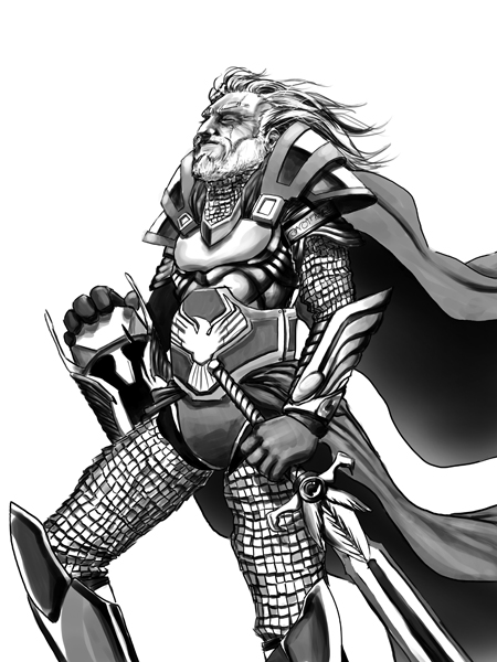
Final black and white render.
Step 8
Now we will begin the coloring process. I will be using a customized set of Swatches. To do this, do a screenshot with your normal set of Swatches visible. Paste it (Cmd/Ctrl + V ) in a new layer and crop everything but your Swatches.
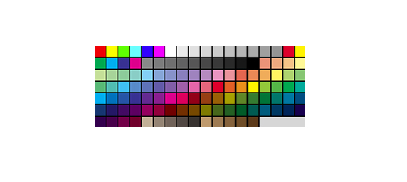
Duplicate this layer. Lower its opacity to 15 – 30%. Hit Cmd/Ctrl + U (Hue/Saturation) and tick colorize. Now change the Hue value to your desired one.
Merge down (Cmd/Ctrl + E ) both layers. Place this layer on top of your illustration and color pick from there.
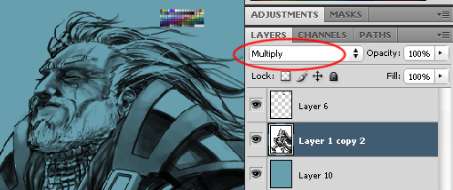
Step 9
Set your character’s blending mode to Multiply. Create a new layer underneath and fill it with your desired color taken from your customized Swatches.
Step 10
With the soft brush, start adding colors to the background. Don’t worry about the character too much. Set the general atmosphere here.
Step 11
Polish the background. Try to use as many references as possible.
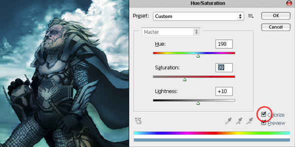
Step 12
Once done with the background we will go back to the figure. Hit Cmd/Ctrl + U (Hue/Saturation) on the characters layer and tick colorize. Change the values until you achieve a color similar to the background.
Step 13
Merge down (Cmd/Ctrl + E ) both layers. If you feel like, work on a layer over this merged layer. In the end you will be merging this new layer. It is important to know where the light is coming from and which its sources are. Keep working over the image. Take a special interest to the glows, shadows. Keep adding colors and tones over what you already have.
Step 14
The chain mail might seem annoying, though I find it really exciting. Chain mails can vary in shape and size. Bear always in mind the direction, general shape and illumination of the scales. Yes, you will have to think about each individual scale.
Once you start, it goes really fast. Remember that each scale might project a shadow on the scale underneath it. Also try to randomly darken or enlighten individual scales.
Step 15
When working on the hair try to stick to just three colors (highlight, midtone, and shadows).
Draw the tufts trying to follow the wind orientation.
Draw individual hair with your highlight color and your shadow color. This will add realism.
Apply all this to the beard though taking into account that it has shorter and stiffer hair.
Step 16
Same as the hair process, we will be using three main colors.
Pay special attention to the wrinkles direction.
Step 17
Create a new layer. We will select all the metal parts. There are several ways of selecting, though I prefer using Edit Quick Mask mode (Q) for this special case. Paint Bucket tool (G) with black. Use white to draw over the desired parts you want to select.
Once done, change to Edit in Standard mode (Q). Every white area you’ve painted will become selected areas.
Click on Add layer mask.
Open a rock texture (mine was taken from cgtextures.com). Paste it over this new layer. Change this Blending Mode to Soft light and change its opacity to 15-30%. Merge down (Cmd/Ctrl + E) this layer.
Step 18
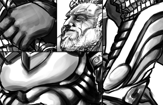
Details. I just love them. Zoom in and let the fun begin! You can add as much as you like. Beat up our character. Imagine what happened in the battle. Where he was wounded. How he was wounded.
Step 19
If you have been working on several layers, merge them (Cmd/Ctrl + Shift + E). Open Curves (Cmd/Ctrl + M) and softly modify the values.
Conclusion
Duplicate this layer. Filter > Blur > Gaussian Blur. Choose a value between 3.0 and 4.5. Lower this layers opacity to 40-60%. Merge down this layer and we are done.
Hope you can learn something new from this tutorial.
I feel really glad if you give me feedback through comment below. Soon i am going to show more interesting & innovative tutorials so please keep visit our blog. That’s for now.
Have fun!
Feel free to contact with Clipping Design for clipping path service, image editing service, image masking service or any kind of design support.
Thank you…
Credit: tutsplus.com
No comments:
Post a Comment